Network Geovisualization for Electricity Grid Distribution Systems
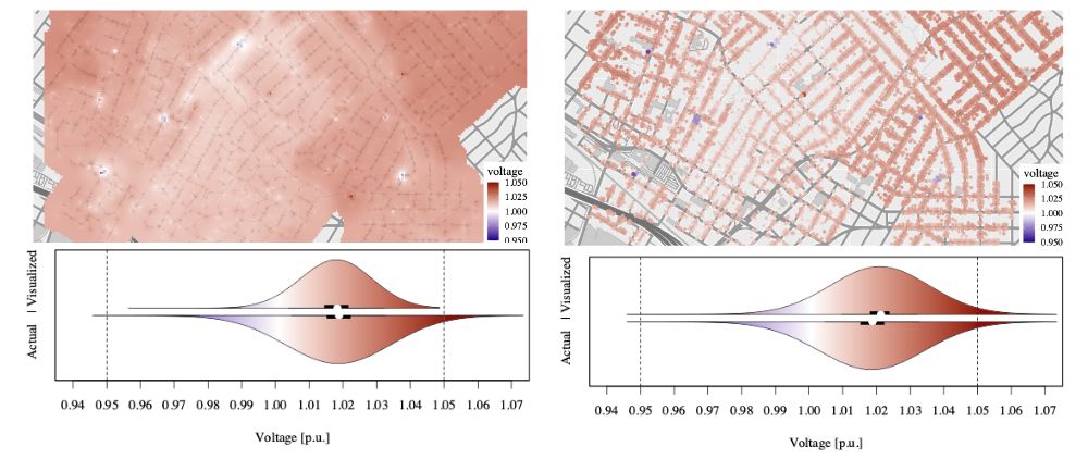
Electrical grids are geographical and topological structures whose voltage states are challenging to represent efficiently for visual analysis, especially at scale. The current common practice is to use colored contour maps (i.e., heatmaps), yet these can misrepresent the data primarily because they average values over geographic distance, while ignoring network (i.e., topological) distance. This especially becomes a problem when maps are ‘zoomed’ out, where averaging will lead to the erasure of important larger or anomalous values.

This project develops novel network heatmap visualizations as well as a web application, examining the suitability of four alternative visualization methods for depicting voltage data in a geographically dense distribution system—Voronoi polygons, H3 tessellations, S2 tessellations, and a network-weighted contour map, which this last one being a novel method developed by us. We find that Voronoi tessellations and network-weighted contour maps more accurately represent the statistical distribution of the data than regular contour maps, but we intend to experiment with larger scale visualizations to see how network planners or managers can gain quick understanding of the network state using these methods.
This project is funded by the National Renewable Energy Laboratory in collaboration with the Visualization team led by Kristi Potter and Kenny Gruchalla.
Geographic Forecasting of COVID-19 Case and Hospitalizations Incidence Next project
Sea Ice Mapping and Uncertainty Quantification


